Summary
Summary
Background
Background
Background
I joined DMG as the first designer in the team, tasked with improving the user experience for a product that had an incomplete design system—essentially, a half-finished style guide. With a growing design team and new product teams coming on board (such as the provider portal and technician mobile app), it became apparent that there were inconsistencies across designs. Each product was being developed with its own design language, and designers were repeatedly building the same components. I was asked to take charge and establish a more cohesive and scalable design system.
One of the critical challenges was that I had no formal training in design systems, but I was determined to create a system that could grow and adapt with the evolving team. Working alongside Mike, a newly hired Design System Manager, I leveraged my experience and collaborated closely with cross-functional teams to create a design system that met the needs of both the product and development teams.
Outcome
Outcome
Outcome
Before and After
Before and After
Before and After
Details
Details
Scope & Considerations
Scope & Considerations
Scope & Considerations
As a solo designer initially, I had limited time to dedicate to the design system while managing ongoing UX/UI projects. The system had to be scalable quickly, given that I was constantly discovering new use cases and expanding the library of components. My approach was to create a design system that could grow and adapt to future needs, focusing on modularity and reusability.
Working closely with Mike (Design System Manager) and the product teams, we established short-term and long-term priorities. The goal was to make the system flexible yet structured, ensuring we could move fast and iteratively while maintaining consistency.
Evolution of the Design System
Evolution of the Design System
Evolution of the Design System
Signs that we might need a design system
Signs that we might need a design system
Before deciding to implement a comprehensive design system, we observed several signs across the product and teams that indicated a need for greater consistency and efficiency:
Inconsistency: We saw inconsistent design patterns across different teams, leading to confusion and a fractured user experience.
Multiple Product Designs: As the company began to manage multiple products, each had its own set of design standards, creating a disconnect in user experience.
Multiple Device Designs: There was a growing need for designs that worked across various devices, requiring a unified approach.
Design Redundancy: Teams were repeatedly designing the same components, leading to wasted time and effort.
Onboarding More Designers: As the design team grew, it became clear that a standardized design system was essential to bring new designers up to speed quickly and maintain consistency.
Audit Process
Audit Process
To create a strong foundation for the design system, we performed a thorough audit with key contributors from different departments:
Designers: We collaborated with designers to evaluate existing design assets and identify areas of inconsistency and redundancy.
Developers: We worked closely with developers to understand the gap between the design and development processes, identifying where communication or implementation issues arose.
Support Team/QA: Engaged with the support team and QA to understand what needed to be displayed in different error states and user flows, ensuring the design system addressed all real-world use cases.
Contributors & Team Expansion
Contributors & Team Expansion
Initially, I was the sole designer responsible for creating the style guide and managing a half-finished design system. However, with more designers joining and the need for a more robust design system, we secured buy-in from stakeholders to bring on a Design System Manager—Michael—who would work alongside me to lead the design system management while I continued to handle ongoing UI/UX projects.
Initially, I was the sole designer responsible for creating the style guide and managing a half-finished design system. However, with more designers joining and the need for a more robust design system, we secured buy-in from stakeholders to bring on a Design System Manager—Michael—who would work alongside me to lead the design system management while I continued to handle ongoing UI/UX projects.
How We Implemented
How We Implemented
To create a scalable and efficient design system, we followed a phased approach that combined existing design systems with customizations to meet our branding needs. Here's how we proceeded:
Combination Approach: We used Material UI (MUI) as a base design system, then customized it to align with our branding and specific product needs. This gave us a solid starting point while maintaining flexibility for our unique requirements.
MUI base with our Branding Theme
MUI base with our Branding Theme
MUI base with our Branding Theme
Strategy
Strategy
Our implementation strategy was iterative, evolving as we received feedback and as the product and team grew. We took a phased approach to ensure that the most critical aspects of the system were addressed first:
Defined Principles: We gathered perspectives from stakeholders across the business (PM, UX Writer, Marketers, Support, Designers) to define the core principles of the design system.
Foundations: We started with essential components like buttons, typography, form fields, and colors, ensuring that everything was consistent.
Critical Components: We prioritized important UI components and patterns, focusing on reusable elements that could scale across the product.
Documentation: We created documentation for components and patterns in Figma and Confluence, making sure that everyone had easy access to the source of truth.
Iterative Process: As the system was being used across more teams and projects, we continuously updated and refined it, ensuring it grew with the needs of the product.
Principles
Principles
To ensure that the design system reflected the needs of the business and users, we engaged a diverse group of stakeholders to define the core principles that would guide our work:
♿ Accessibility: Ensuring the design system is inclusive and usable by people with varying abilities.
🔄 Redundancy: Reducing repetitive work by standardizing components and patterns.
🧩 Modularity: Creating a flexible system where components are reusable and can be easily adapted to various use cases without redundancy.
✨ Standardization: Unifying design across products to ensure cohesion and streamline development.
These principles acted as our guiding framework for building and evolving the design system over time.
Not Just a Set of Components
Not Just a Set of Components
The design system was not merely a collection of UI components; it was built with the goal of improving the overall user experience. We conducted user research, usability studies, and discovery exercises to ensure that the system aligned with user needs. Additionally, we considered real-world data scenarios during the design process to avoid the common pitfalls of using placeholder text in designs.
This focus on real data allowed us to anticipate challenges early on:
What if there is a customized date picker with unique styles or behavior?
What if providers or customers don’t have logos or images to display?
What if there are more than three pages? How should the breadcrumbs be displayed?
What if pagination needs to be customized for different screen sizes?
How should global navigation adapt across different products and devices?
By addressing these questions early in the design process, we minimized potential roadblocks during development and testing.
Laying the Foundations
Laying the Foundations
We started by defining the typography and color palette, considering the emotional impact on users. Given that many users would be going through a stressful time (such as job loss), we aimed to create a soothing and supportive environment through the design. The goal was to ensure the platform’s tone felt like helpful guidance rather than adding pressure.
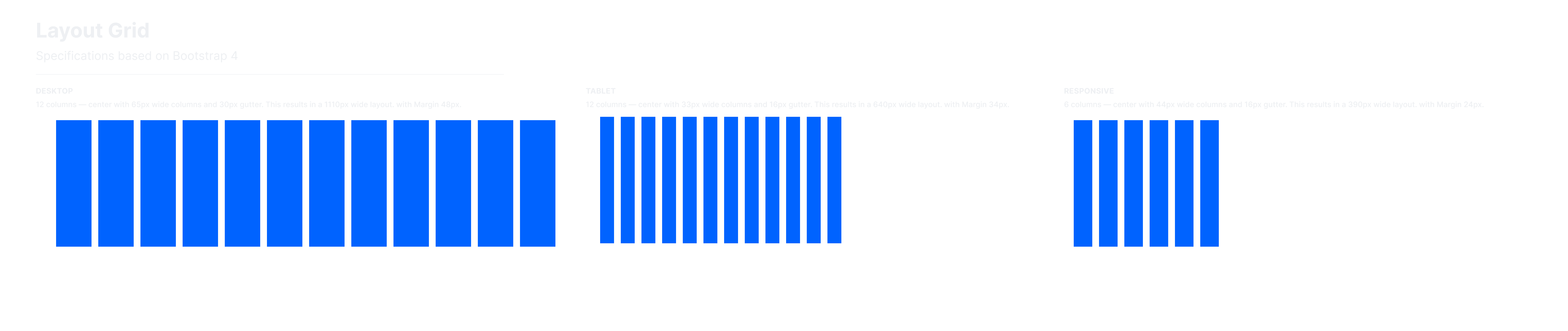
We also defined key design elements such as grids, breakpoints, and information architecture. Working with the development team, we ensured that the design system could scale with the technical setup, defining the grid structure across key breakpoints based on the front-end engineers’ setup in Tailwind CSS.
Grids and Breakpoints
We made sure that the design system supported responsive layouts at different screen sizes, ensuring a smooth experience across devices. This approach minimized the need for custom adjustments on specific breakpoints, making the design system more efficient and scalable.
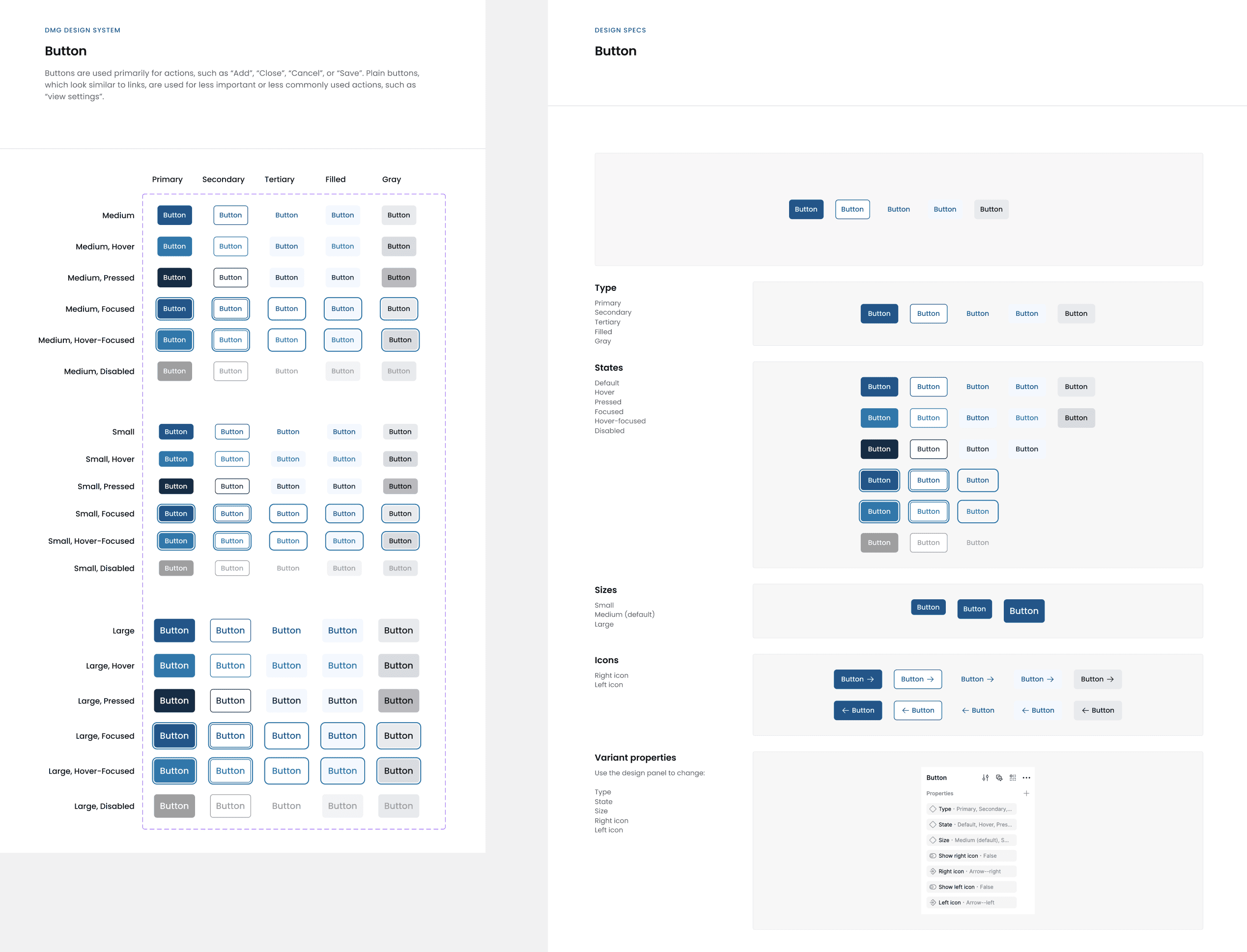
Atomic Design Approach
We adopted the Atomic Design methodology to break down the design system into smaller, reusable components. As the system evolved, I worked closely with the developers to ensure the components were well organized, with consistent naming conventions and clear documentation. This collaboration ensured that the design system was mirrored in Storybook for a smooth developer handoff.
We started by defining the typography and color palette, considering the emotional impact on users. Given that many users would be going through a stressful time (such as job loss), we aimed to create a soothing and supportive environment through the design. The goal was to ensure the platform’s tone felt like helpful guidance rather than adding pressure.
We also defined key design elements such as grids, breakpoints, and information architecture. Working with the development team, we ensured that the design system could scale with the technical setup, defining the grid structure across key breakpoints based on the front-end engineers’ setup in Tailwind CSS.
Grids and Breakpoints
We made sure that the design system supported responsive layouts at different screen sizes, ensuring a smooth experience across devices. This approach minimized the need for custom adjustments on specific breakpoints, making the design system more efficient and scalable.
Atomic Design Approach
We adopted the Atomic Design methodology to break down the design system into smaller, reusable components. As the system evolved, I worked closely with the developers to ensure the components were well organized, with consistent naming conventions and clear documentation. This collaboration ensured that the design system was mirrored in Storybook for a smooth developer handoff.
Grids across key breakpoints
Grids across key breakpoints
Grids across key breakpoints
Atomic Design Approach
Atomic Design Approach
We adopted the Atomic Design methodology to break down the design system into smaller, reusable components. As the system evolved, I worked closely with the developers to ensure the components were well organized, with consistent naming conventions and clear documentation. This collaboration ensured that the design system was mirrored in Storybook for a smooth developer handoff.
We adopted the Atomic Design methodology to break down the design system into smaller, reusable components. As the system evolved, I worked closely with the developers to ensure the components were well organized, with consistent naming conventions and clear documentation. This collaboration ensured that the design system was mirrored in Storybook for a smooth developer handoff.
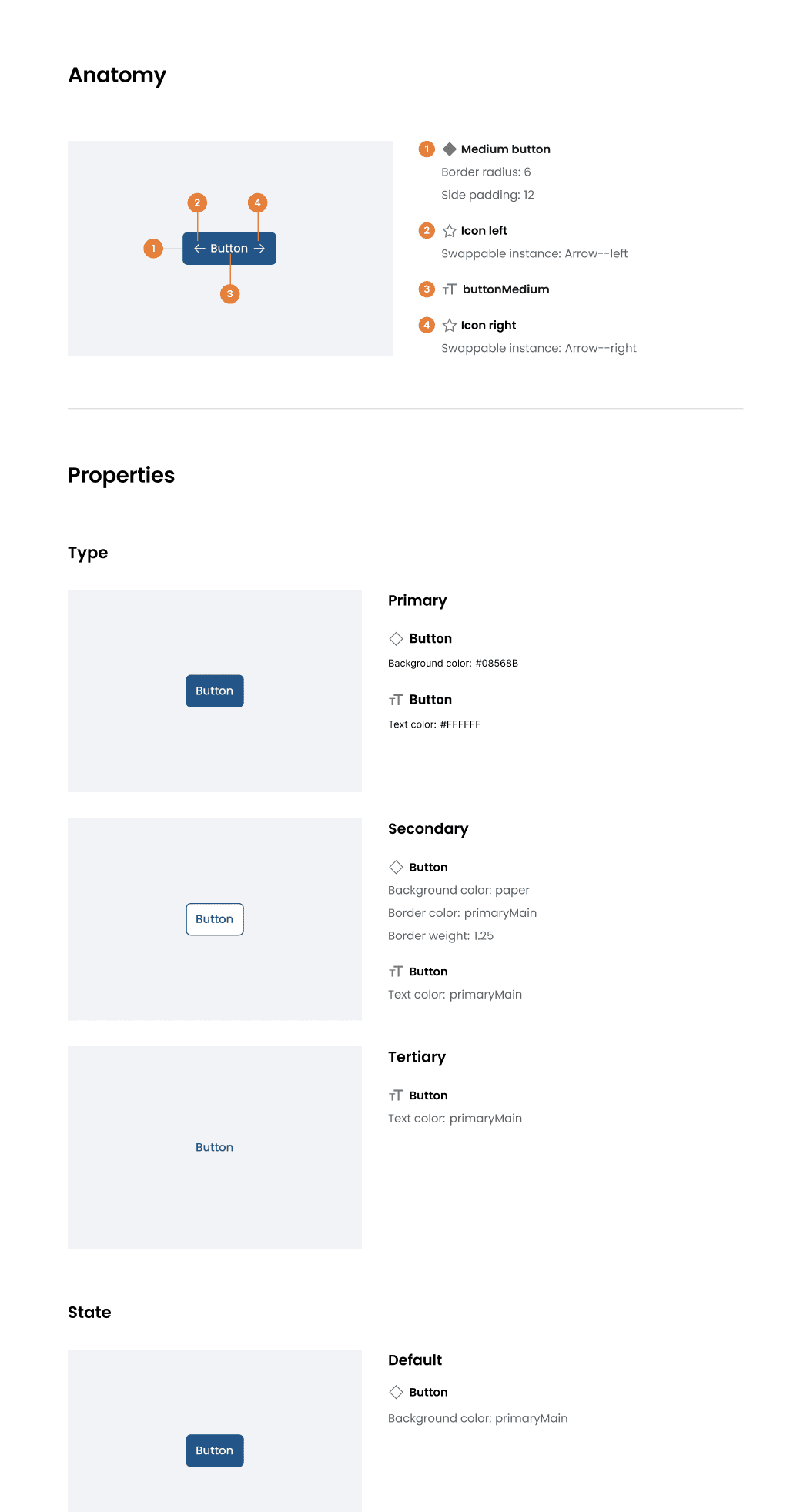
Example of nested components development
Example of nested components development
Example of nested components development
Accessibility Baked into the Process
Accessibility Baked into the Process
One of the key advantages of building a design system from scratch was the ability to integrate accessibility from the start. We focused on several aspects of accessibility, such as:
Checking color contrast across different background and interaction states
Ensuring font sizes were accessible for web readability
Adding text labels for icons and providing tooltips for clear navigation
Maintaining consistency in layout and UI elements to improve usability
Although there were time constraints, we laid the foundation for an accessible system and set the stage for ongoing improvements.
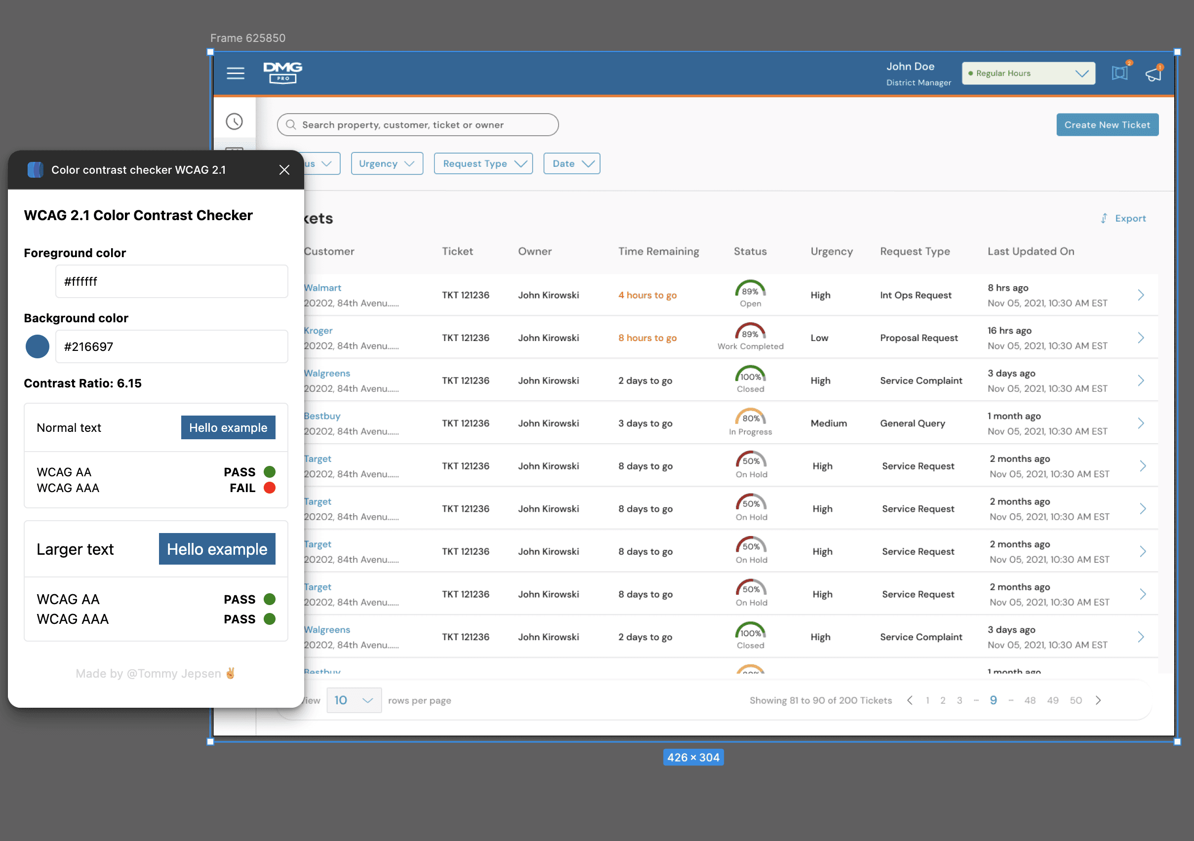
Examples of Accessibility Considerations
Examples of Accessibility Considerations
Examples of Accessibility Considerations
Pragmatic Creativity
Pragmatic Creativity
While following the design system was crucial, there were moments when creative flexibility was needed. Some of the more complex screens required me to step outside the established rules to re-evaluate existing components or create new ones. This balance between structure and creativity was key to maintaining a scalable yet innovative system.
While following the design system was crucial, there were moments when creative flexibility was needed. Some of the more complex screens required me to step outside the established rules to re-evaluate existing components or create new ones. This balance between structure and creativity was key to maintaining a scalable yet innovative system.
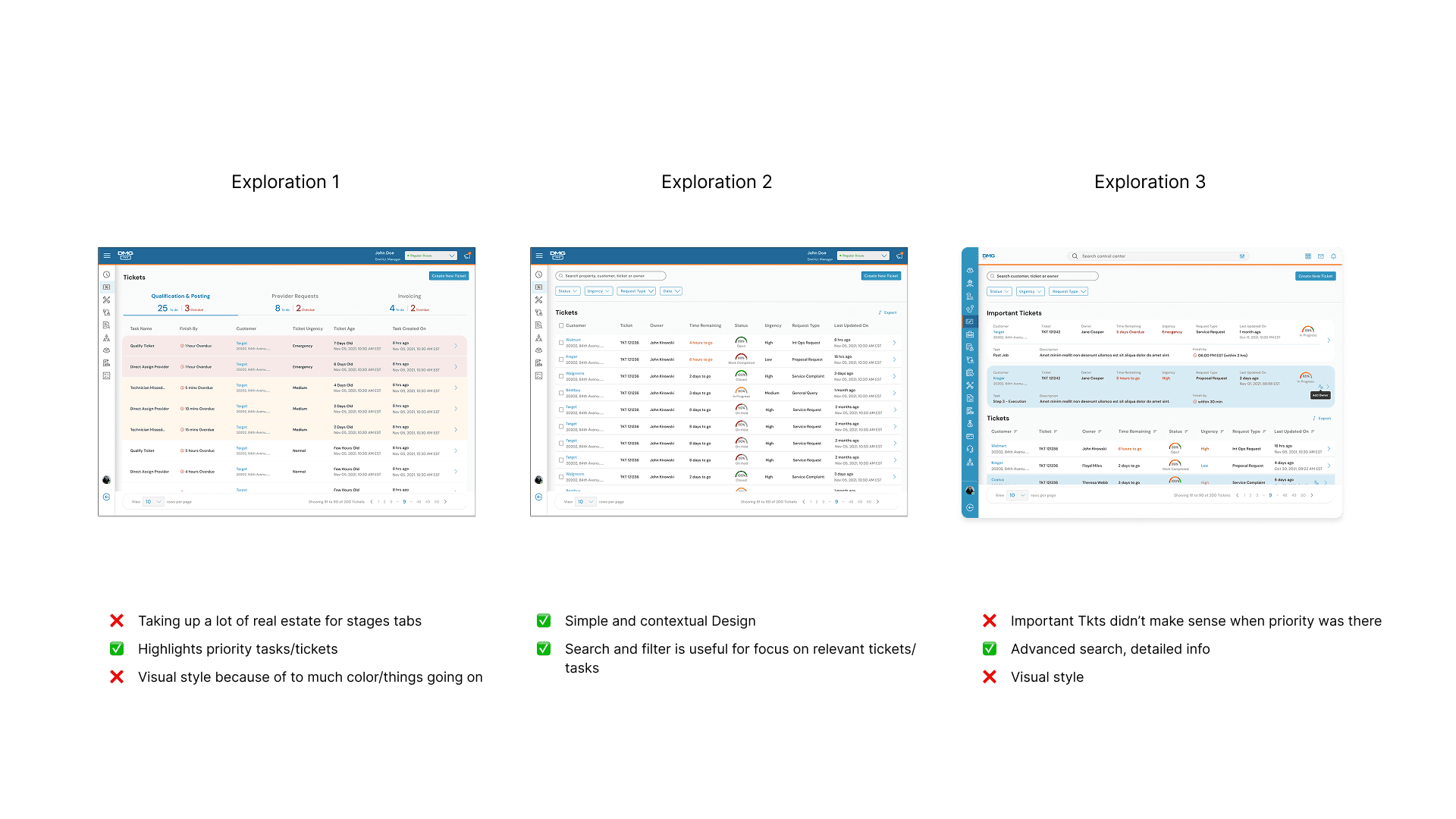
Examples of Iterations on a Layout of Ticket List View
Examples of Iterations on a Layout of Ticket List View
Examples of Iterations on a Layout of Ticket List View
Asynchronous Communication
Asynchronous Communication
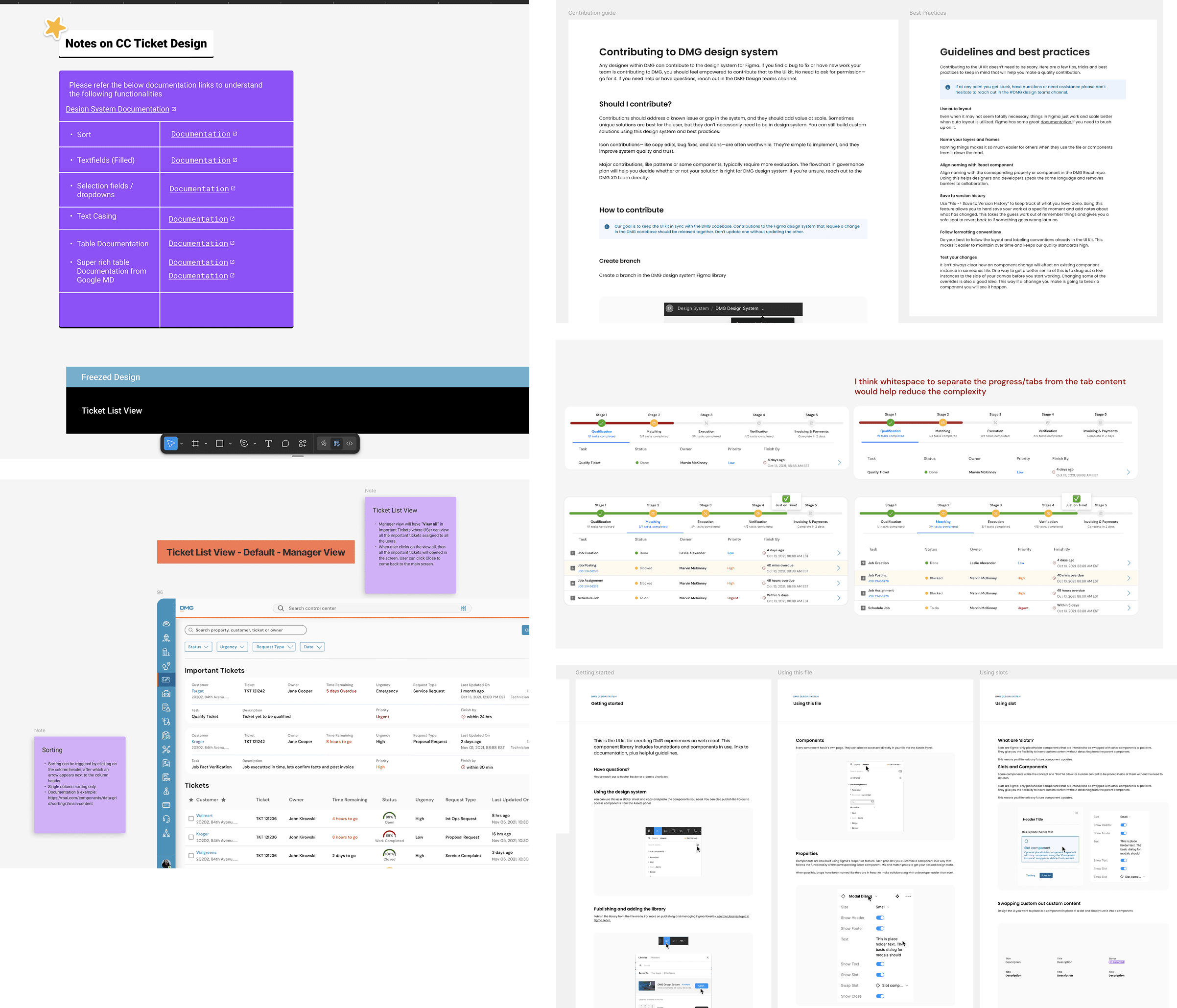
A successful design system is not just about creating components; it’s about ensuring the entire team understands how and why to use them. I documented my design decisions in Figma files, added contextual notes, and provided video walkthroughs to communicate with the broader team. This asynchronous communication made it easier for stakeholders and developers to understand the system, even if we couldn’t always meet in real-time.
Movement in Figma
By including detailed notes and annotations directly in Figma, I provided context for interactions and complex design flows, making it easier for both designers and developers to follow the logic behind each design decision.
Result
In under six months, we successfully launched the initial version of the design system. While not a completed product, it was designed to be scalable and iterative, with a changelog in place for continuous updates and refinements. The impact was significant:
The design system provided a cohesive look and feel across the entire product suite.
It accelerated the design-to-market process by enabling faster iterations and reducing duplication of work.
Developers gained a single source of truth, ensuring consistency across all products.
The system was flexible enough to grow and adapt alongside the evolving product and team needs.
By prioritizing scalability, accessibility, and collaboration, we created a solid foundation that not only streamlined current processes but also set the stage for the future evolution of the product and its design system.
Documenting the intended interactions in Figma
Documenting the intended interactions in Figma
Documenting the intended interactions in Figma
Result
In under six months, we successfully launched the initial version of the design system. While not a completed product, it was designed to be scalable and iterative, with a changelog in place for continuous updates and refinements. The impact was significant:
The design system provided a cohesive look and feel across the entire product suite.
It accelerated the design-to-market process by enabling faster iterations and reducing duplication of work.
Developers gained a single source of truth, ensuring consistency across all products.
The system was flexible enough to grow and adapt alongside the evolving product and team needs.
By prioritizing scalability, accessibility, and collaboration, we created a solid foundation that not only streamlined current processes but also set the stage for the future evolution of the product and its design system.
Design Examples with different breakpoints
Design Examples with different breakpoints
Design Examples with different breakpoints
Suruthi.
Thanks for stopping by, let’s chat! 👋
Suruthi.
Thanks for stopping by, let’s chat! 👋